 Bloggers…we like to work on our laptops and computers. As creators, it’s simpler. But we are giving our content to a world that likes to be mobile. Have you ever thought about your links, posts, blogs, and site from the perspective of a smartphone user?
Common Problems
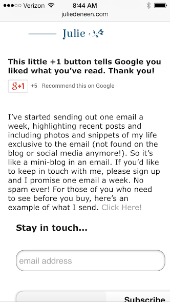
Blog Sidebars Disappear
On most mobile versions (whether you use jetpack’s mobile version or you use a plugin like WPtouch), the sidebar disappears. That means all your beautiful follow icons, email subscription signup forms, and other goodies are not available for mobile users.
The solution…
Create a custom signature at the end of every post! When your readers are done, they can click to your profiles, hit a few buttons, or fill in their email address to get new post notifications. I wrote a post about adding social follow buttons in a signature that may be helpful!
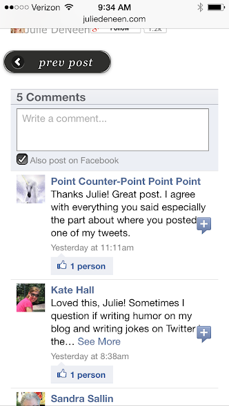
Filling out those comment fields is annoying!
It can be annoying for people to fill out their name, email, and website in order to comment on your blog from a smartphone. When push comes to shove, I usually don’t bother saying anything at all.
The solution…
Integrate Facebook commenting in place of or in addition to your traditional comment system. Most people are logged in continuously on their phones, so they bypass all the name, email, fields and just comment and go!
Another thing to know! If you happen to be commenting from a mobile device, you can create custom shortcuts for things you enter repeatedly. So for example on my phone, xx is for my name, yy is for my email, and zz is for my website. I just type in those two letters and it auto-populates the field for me!
The comment replies on Facebook pages don’t work on mobile!
This was a great tip I recently discovered from a fellow blogger. If you have comment replies turned on for your Facebook page, people who are reading from a smartphone can’t follow the comment threads easily. The comment replies also display them according to top comment, rather than in order of time. Super annoying!
The solution…
Turn them off! I posted on Fabulous Blogging’s FB yesterday a post on how to get that done.
Mobile Tips
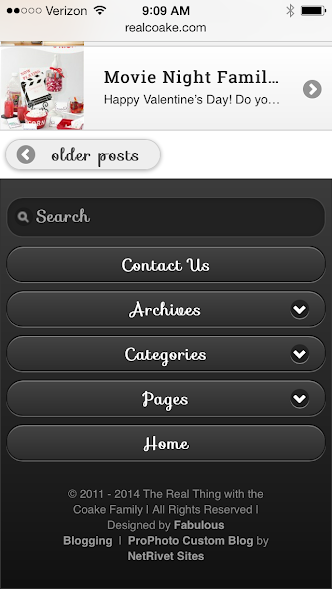
Create a mobile friendly menu on your blog.
People are less likely to browse through a site on their Smartphone, especially if there are tons of choices on your menu bar. Instead, you want to give fewer choices, but make them compelling. A mobile menu for your site will get your readers to the pages they want, and skip out on all the extra ones that aren’t as important.
Every about section on every profile should be filled out!
Even if you aren’t the kind to browse Pinterest or Twitter from your phone, others do. Look at the mobile versions of each platform and see how your About section reads. Are the most important facts at the top? A link to your site? The same goes for a FB page post. Watch where the “continue reading…” cuts off your text. Whatever is above it should be the most important headline.
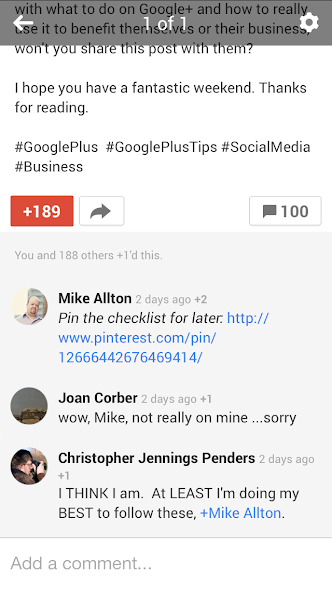
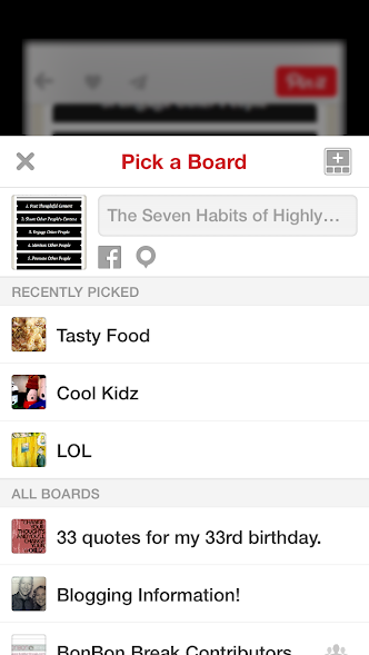
Use “pin for later” links, especially on Google plus.
If I’m browsing G+ on my phone, I can’t easily pin a recipe or photo I see in the field… UNLESS there is a pin for later link. The easiest way for you to do this on your posts, is to pin your content to Pinterest, bring up that pin, and grab the URL. Then you can shorten it if you’d like (with Hootsuite) or simply paste it into your status update. When I click on those links from Google plus, it opens up Pinterest right on my phone. You can also add a pin for later link on your Facebook posts as well!
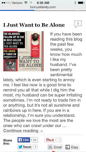
 This is what it looks like on my FB post.
Consider post excerpts.
Slow sites will move at snail’s pace on a phone. If you aren’t running a mobile theme, you need to change your blog so that excerpts come up, rather than full posts. When people type in your URL, it’s better for quick summaries to appear than for pages and pages of pictures and text. And if you notice sites with mobile plugins? They all utilize excerpts.
Only offer the link opening in a new tab if it’s going off your site.
When you create a hyperlink in a post, some people choose to check off the box that says “Open in a New Window.” This is not necessary if you are linking to content that’s within your site, especially because mobile users will hate all those Safari window tabs opening up every time they click on something. Save the new window for links that take them off your blog, and leave it at that.
Make sure there is a search bar.
This is crucial to mobile users, especially if you run a resource or niche blog. The search bar should be easy to find! The jetpack mobile plugin puts it right at the top, but if you’re using Weaver Pro for example, you will need to specify where you want the search bar in the mobile version.
Stop running plugins that display improperly on mobile.
A perfect example of this are those vertical share bars that scroll down the page as you’re reading. They often cut off your text or distract your reader when on a small screen. There are plenty of workarounds (starting with the simple sharing buttons that come in Wordpress). You’ll have the added benefit of one less plugin!
Get a mobile, responsive WordPress theme.
I’ve added a resource list of the best responsive themes of 2013. The responsive themes don’t have mobile versions – they simply adjust to whatever device is displaying the site. This works well for many bloggers. Some of you though, may want the benefits of a traditional WordPress framework (and may not like the style of responsive themes). In that case, Both Weaver Pro and Prophoto offer robust mobile versions that are easy to customize and work beautifully on smartphones!